🌀 aura no. 1 - a trip to scandinavia, italy, and wonderland
what i'm drawing creative inspiration from in october
this week, i’m trying something new! i was experiencing such creative block when it came to writing my dress code newsletters and needed to switch it up. my friend kylie gave me the idea to dedicate one of my monthly emails to the things that inspire me visually. fashion tends to be one of those things, but there is often so much more.
i’m still starting this newsletter with something clothes-related but diving into some of my other visual interests as well. so with that…
finding wonderland (and the perfect dress)
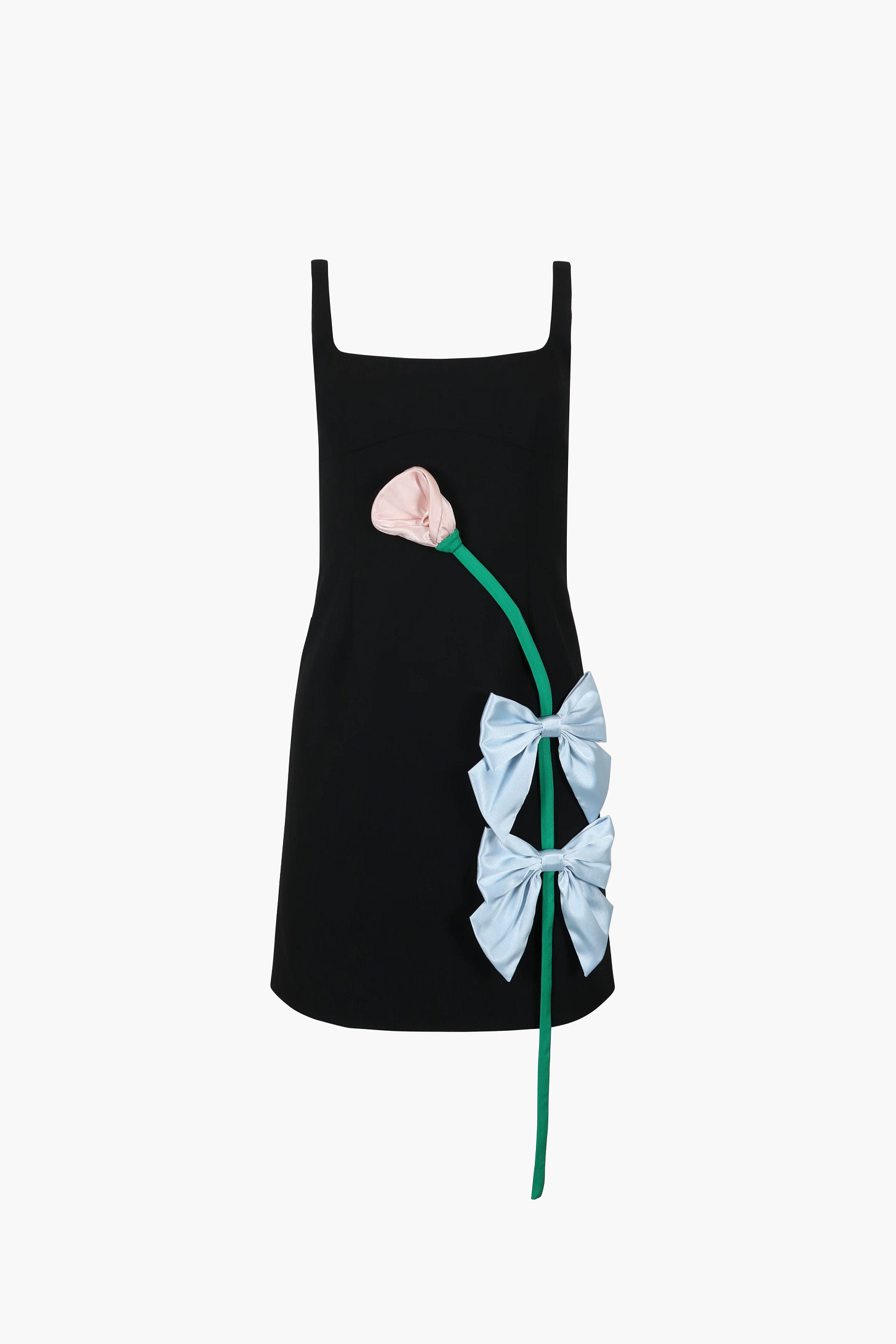
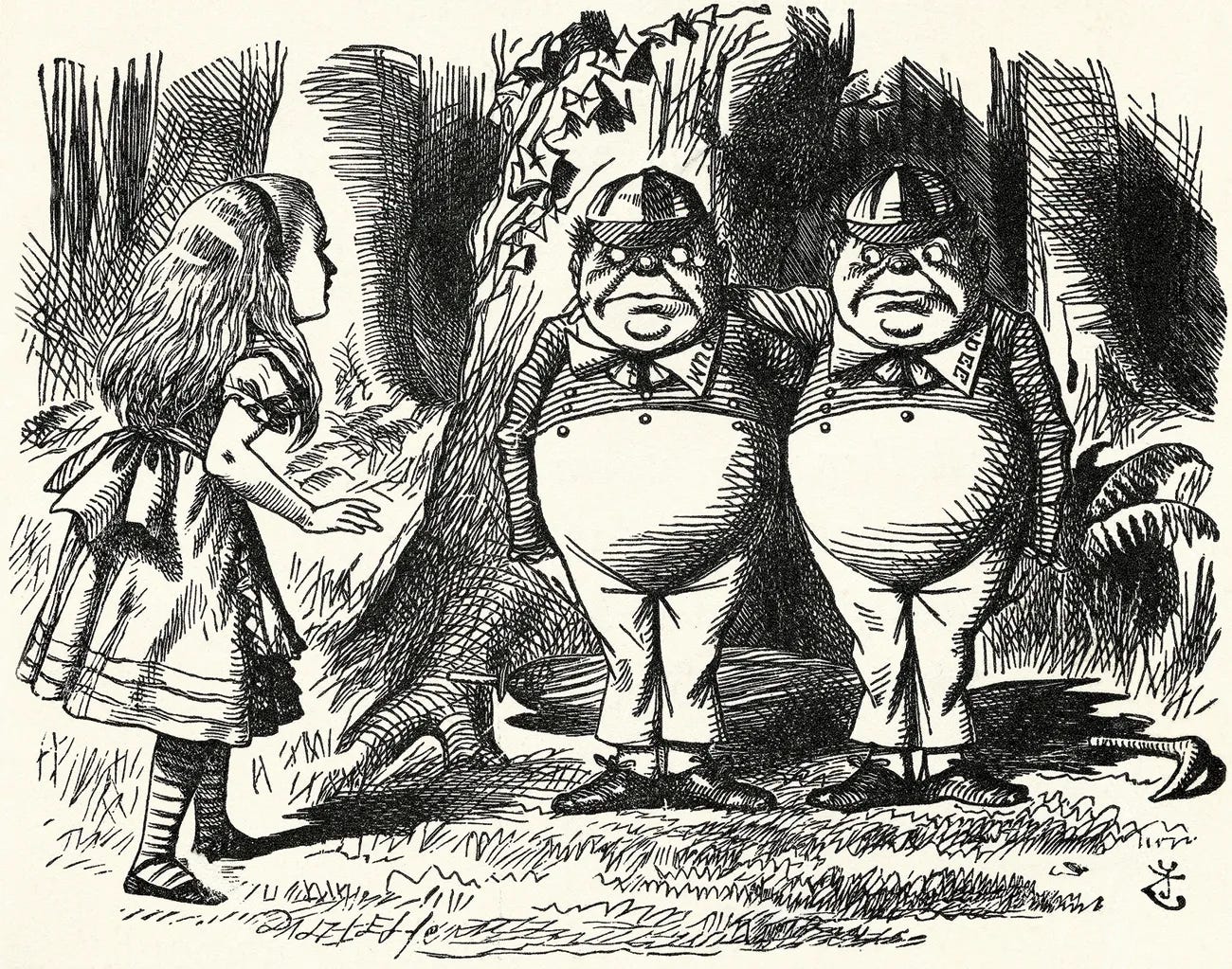
i truly don’t know how it’s already october. this is the fastest any year has flown by and that means the holidays are quickly approaching. every year my job throws an elaborate, themed holiday party. this year’s theme? we’re all mad here. i’ve found a handful of dresses that I’m in love with, but they are out of my price range. like this one from sandy liang.
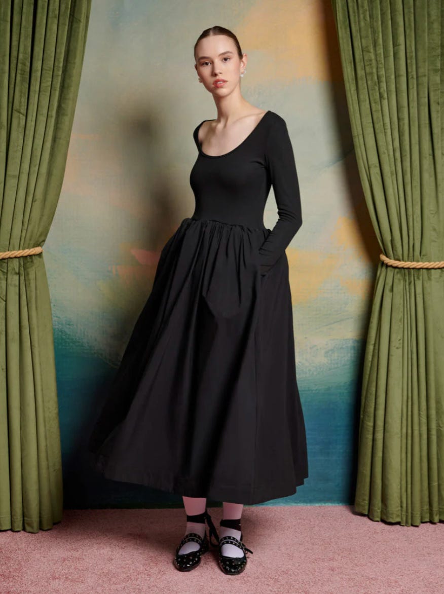
but i will most likely end up buying this dress from sister jane that i can wear time and time again. i imagine making it more whimsical with colored tights and very, very fun makeup (i’ve decided to bleach my eyebrows for this party since i’ll have two weeks off afterward).
clocks
as part of my outfit, i plan to wear a watch choker just like taylor swift’s lorraine schwartz necklace she wore to the grammy’s.
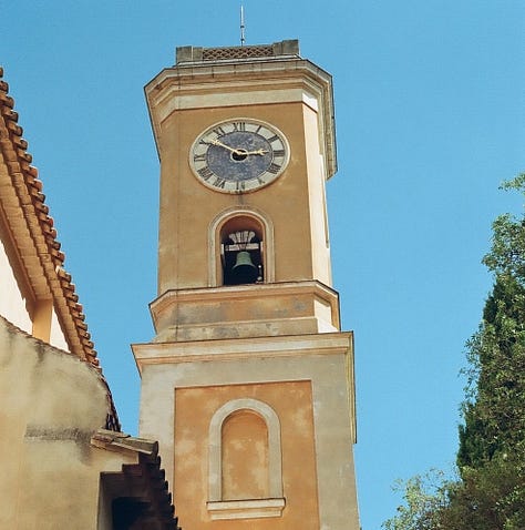
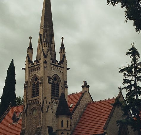
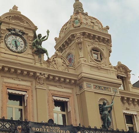
it seems like watches and clocktowers have been something i’ve been very drawn to recently and i didn’t realize how many photos i had taken of clocks in france until i got my film back.
suddenly into scandinavian design
okay, maybe i’m not suddenly into scandinavian design because it’s classic and all around us. especially certain pieces of scandinavian-designed furniture like a wishbone chair or an artichoke light fixture.
it’s all of the clean lines and use of natural wood for me.
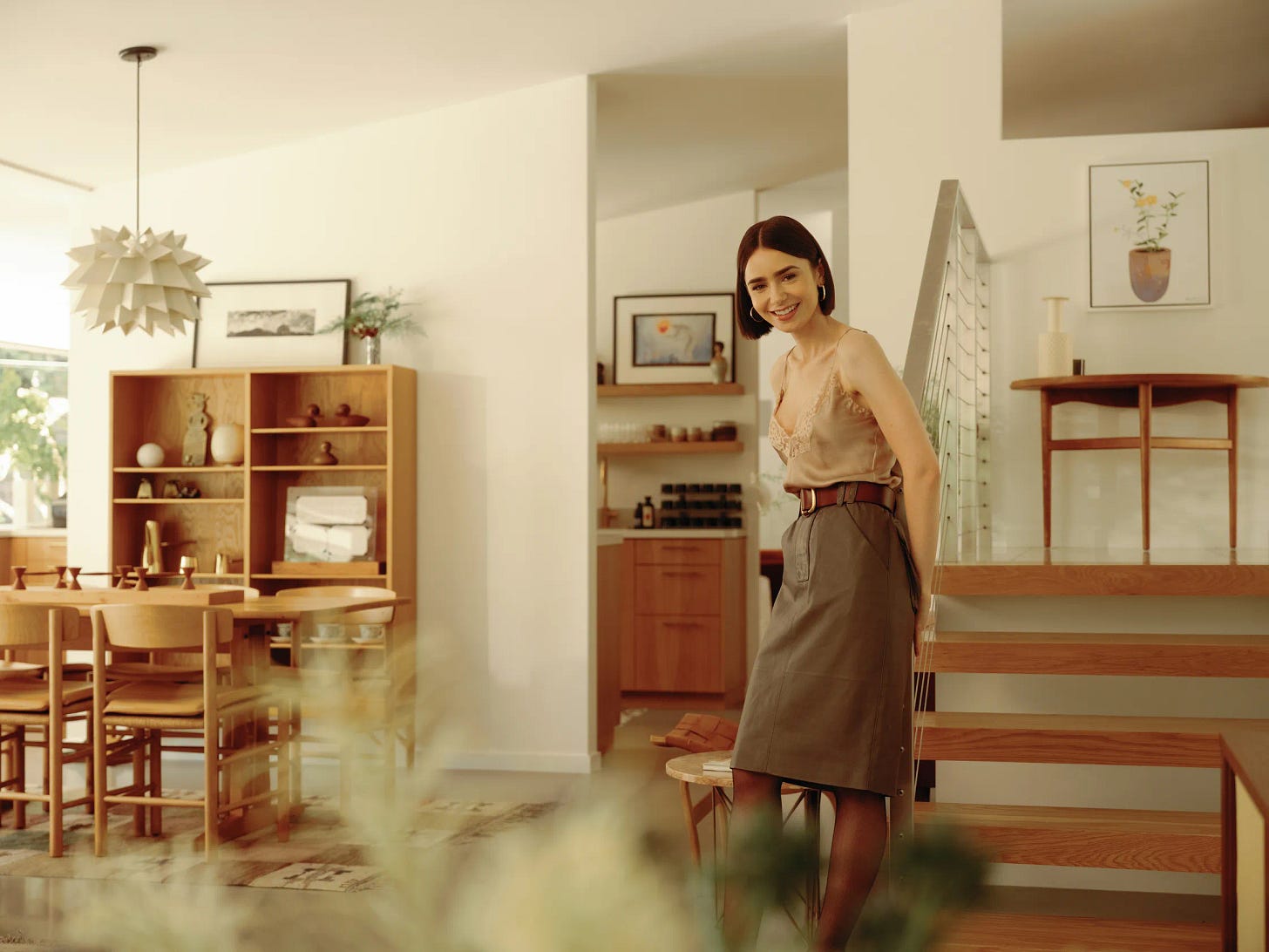
recently, a friend of mine sent me a vogue article on lily collins’ los angeles home and all i have to say is lily has MUCH better taste then emily.
aperitivo please!
one of my favorite courses i took in my undergrad was my typography class. i’ve always been appreciative of a brand with an impactful wordmark as their primary logo. another thing i fell in love with during my undergrad was pentagram — an incredible independent design studio that i personally think everyone should follow.
recently, they did a brand identity project for bacàn, an italian restaurant in williamsburg, brooklyn. the custom art deco typeface for the project is something i haven’t been able to stop thinking about.
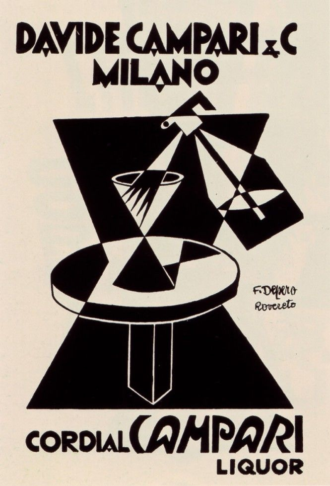
I especially love that this branding is the definition of timeless. it feels like something that will look good on a corner in brooklyn for years to come while also feeling like it’s from the past — and in some ways, it is. the wordmark and branding were inspired by a campari ad from 1926 by fortunato depero.
it’s such a great homage to 1920s italian advertising and the perfect fit for a trendy williamsburg spot.
that is all i have for my first edition of aura which was so fun to write! this new format gives me the creative freedom to still talk about fashion and some of my other interests, including graphic design and architecture.
as always, thank you for continuing to read this little passion project of mine.
with gratitude,
lauren


